KOCA Design Studio had the privilege to collaborate with Dzielnia.bl, a project initiated by the Zamieszkani Foundation, focused on fostering community sharing and ecological sustainability within the Bielany district. The aim was to create a distinctive and memorable logo that reflected the core values of the project: simplicity, minimalism, community, and eco-friendliness.
The brief provided by the client emphasized the need for a clear inscription "dzielnia.bl," a minimalist design using a maximum of three colors, and avoiding a cartoony or artsy style.
The logo was expected to convey the essence of Dzielnia.bl's mission, emphasizing the cashless exchange of items among the local community, ecological consciousness, and a connection to the Bielany district.
Inspired by the project's emphasis on the "second life of things" and ecological principles, the design team conceptualized two distinct versions of the logo.
Official Version:
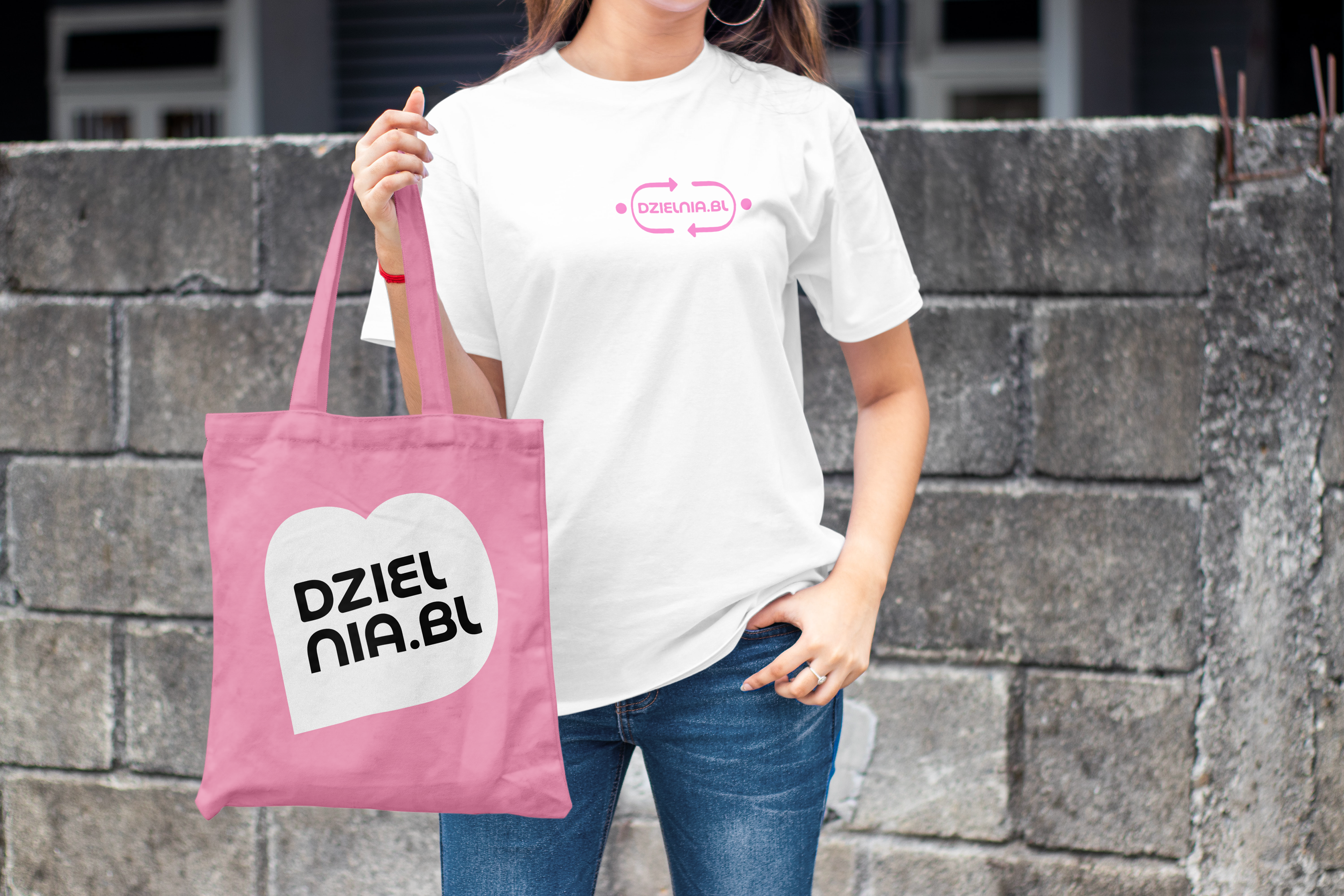
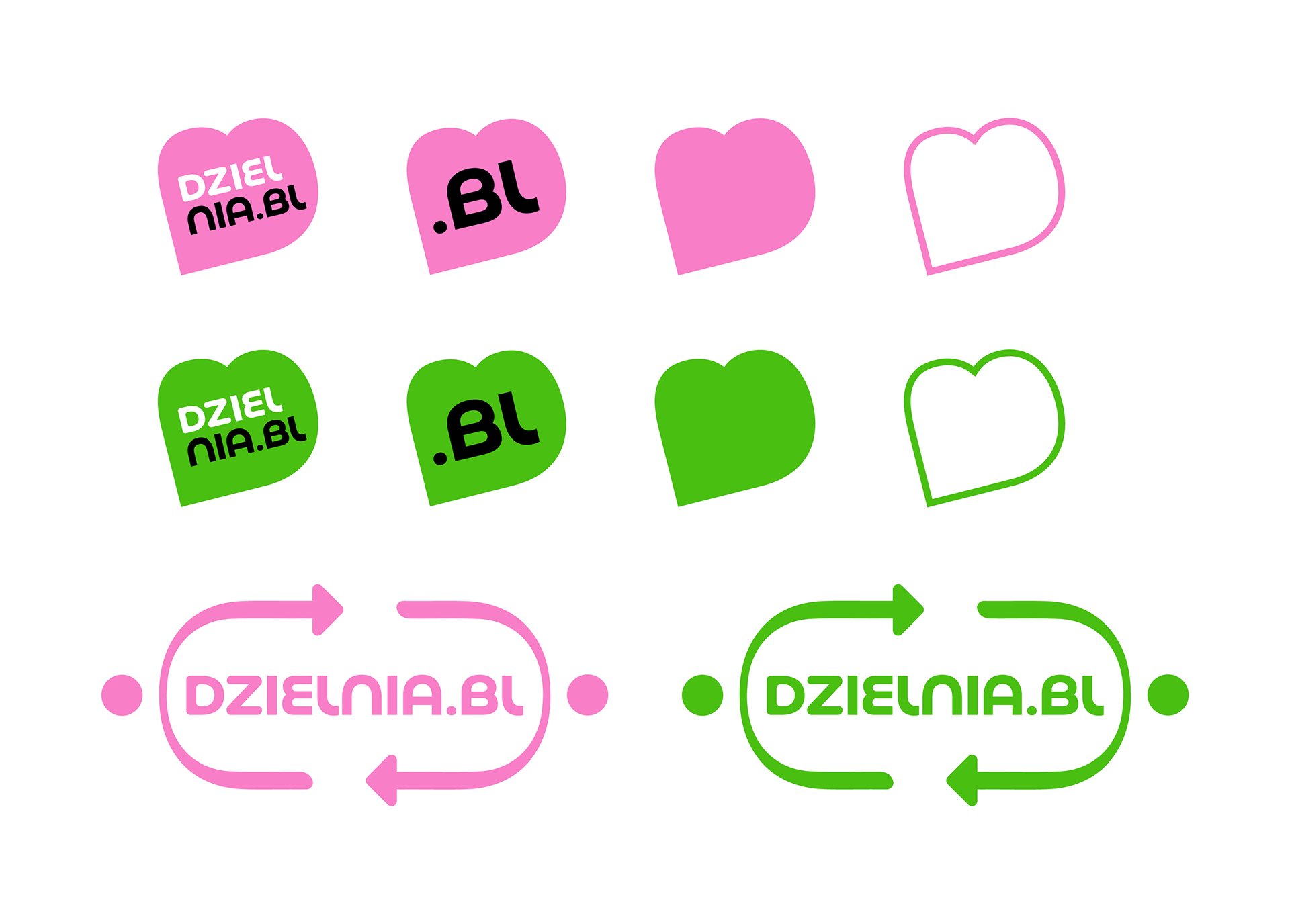
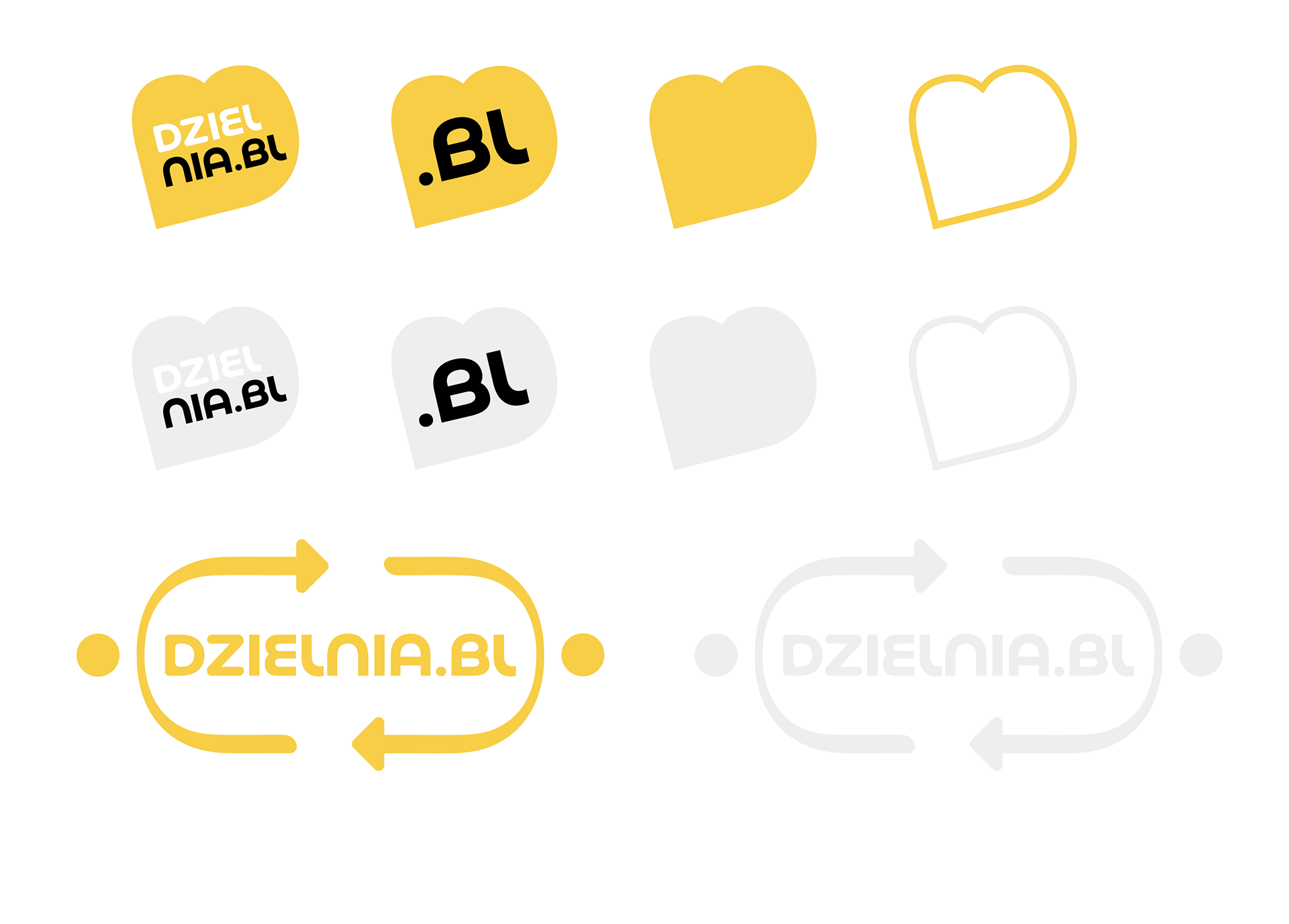
The central element of the official logo is the clear "dzielnia.bl" inscription in Basenji Variable font, reflecting a modern and geometric aesthetic.
Two arrows, symbolizing the second circulation, flank the text, with dots added to mimic people's heads. These dots transform the arrows into hands, depicting the act of sharing among community members.
The composition subtly reinforces the project's core idea and visually communicates the principles of exchange and community engagement.
Social Media Version:
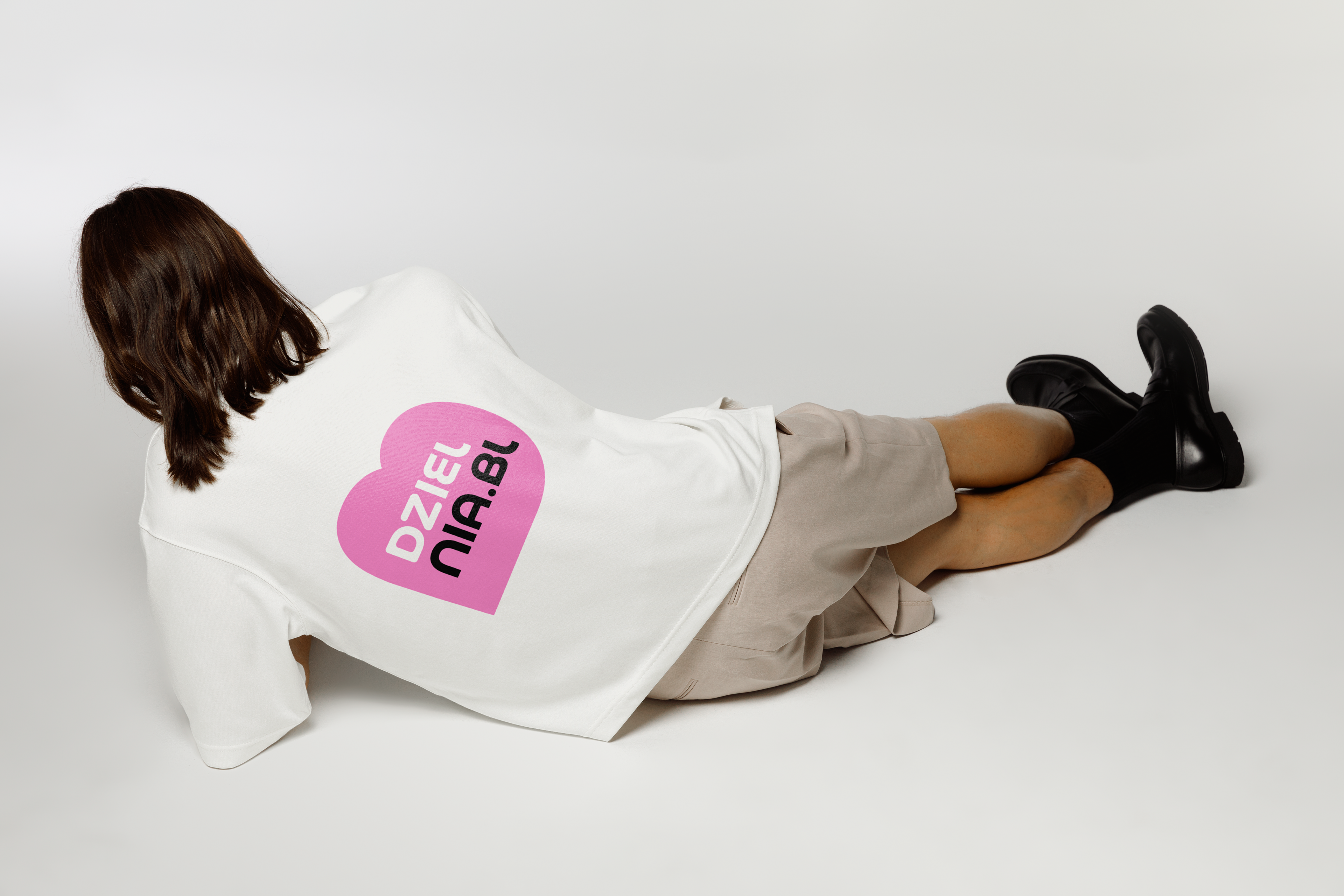
The secondary logo, tailored for social media and marketing materials, features a heart-shaped design incorporating the letter "B" from "dzielnia.bl."
The heart went through multiple color iterations during the design process. However, after careful consideration, the board decided to go with the signature colors of the Zamieszkani Foundation (yellow and black).
The "dzielnia.bl" inscription is creatively split into "dziel" and "nia.bl," with the former highlighted in a different color to draw attention to the concept of sharing.
The selected font, Basenji Variable, draws inspiration from the 1970s geometric design trend, blending elements of Rondo, Pump, Bauhaus, and Blippo. Its practical, versatile design complements the project's modern yet timeless identity.
The redesigned logos successfully encapsulate the essence of Dzielnia.bl, marrying modern aesthetics with a timeless appeal. The distinct graphic elements, such as arrows transforming into hands and the heart-shaped "B," offer flexibility for various applications in visual identification.
The choice of Basenji Variable font adds a touch of retro-futurism, aligning with the project's forward-thinking approach while paying homage to design history.
In conclusion, KOCA Design Studio's collaboration with Dzielnia.bl resulted in a visually compelling and meaningful logo, effectively communicating the project's mission of community sharing, ecological consciousness, and the unique identity of the Bielany district.
